
Why Geometric Tattoos Hold Up So Well Over Time

What should you know about why geometric tattoos age so well over time?
If you’re trying to choose a tattoo you’ll still like in ten or twenty years, this is a smart question to ask. A lot of people are not just drawn to geometric work because it looks clean now — they like it because, when it’s designed and tattooed properly, it often stays readable for longer than styles that rely on ultra-fine detail or very soft contrast.
Why do geometric tattoos usually age well?

Geometric tattoos often age well because they are built on clear structure: deliberate line weight, strong contrast, repeated shapes, and negative space that gives the design room to breathe. As skin changes and ink settles over time, those qualities usually remain easier to read than tiny details packed too closely together.
That does not mean every geometric tattoo will age perfectly. Longevity comes from the combination of design, scale, placement, and execution. A strong concept can still age poorly if the lines are too fine, the pattern is too dense for the size, or the placement is constantly distorted by movement.
What does “aging well” actually mean in practice?
In practice, “aging well” means the tattoo still looks intentional years later. The lines may soften slightly, but the design remains clear, balanced, and easy to read from a normal viewing distance.
That matters more than people sometimes realize. No tattoo stays frozen in its fresh state. Ink settles in the skin. Edges soften. Contrast changes a little. The real goal is not to prevent all change; it is to choose a design that still works after natural change happens.
Geometric tattoos have an advantage here because they are usually based on:
- Simple visual logic rather than tiny realism-based detail
- Consistent spacing between lines and shapes
- High contrast between tattooed areas and open skin
- Symmetry and repetition, which help the eye read the design even if it softens slightly
A portrait can lose likeness if small details blur. A micro-realism piece can lose impact if the finest textures fade together. A well-planned geometric tattoo usually depends less on microscopic detail and more on overall structure.
Who is this a good fit for?
Geometric work is a good fit for someone who cares about long-term readability, likes clean visual order, and is willing to give the design enough size and space to work properly.
It is especially worth considering if you already know you do not want a tattoo that depends on hairline detail. Clients who choose geometric pieces well tend to be comfortable with a design that feels bold, intentional, and slightly more graphic rather than delicate for the sake of delicacy.
It may be a less ideal fit if your main goal is an extremely tiny tattoo with many intricate elements packed into a small area. That is where people often run into disappointment. They want the visual language of geometric work, but at a scale that does not leave enough room for the pattern to stay crisp over time.
What makes geometric tattoos more durable visually than some other styles?

The short answer is that geometric tattoos usually give the ink room to exist cleanly in the skin.
A tattoo ages better when the artist respects a few basic realities:
- Lines need enough weight to remain visible after healing and settling
- Shapes need enough separation so they do not visually merge later
- Negative space needs to be protected so the design can keep breathing
- Black saturation needs to be solid if the piece relies on contrast
Geometric designs often support these decisions naturally. A triangle, circle, grid, ornamental band, or blackwork-based pattern can be adjusted in scale without losing its identity. That flexibility helps the artist build a version that suits the body and the future, not just the stencil on the day of the appointment.
By contrast, styles that are very dependent on tiny textures, soft tonal transitions, or miniature detail can become harder to read if they are done too small or too lightly. That does not make those styles bad. It just means they ask more from the skin over time.
What commonly goes wrong?
The most common problem is not the style itself. It is trying to make the design too small, too detailed, or too delicate for the area.
Here is what we see most often in consultations:
- Patterns packed too tightly so the spaces close up visually over time
- Line weights that are too fine for the intended lifespan of the piece
- Symmetry placed on a body area that moves unevenly, making the design look off even if the stencil was perfect
- Geometric concepts copied from flat digital art without adapting them to the body
- Overpromising precision in areas where skin texture or movement will always affect the result
This is where careful guidance matters. A responsible artist should be willing to say, “This version is too small,” or “This placement will fight the design,” even if the original idea looks good on a screen.
Professional Perspective
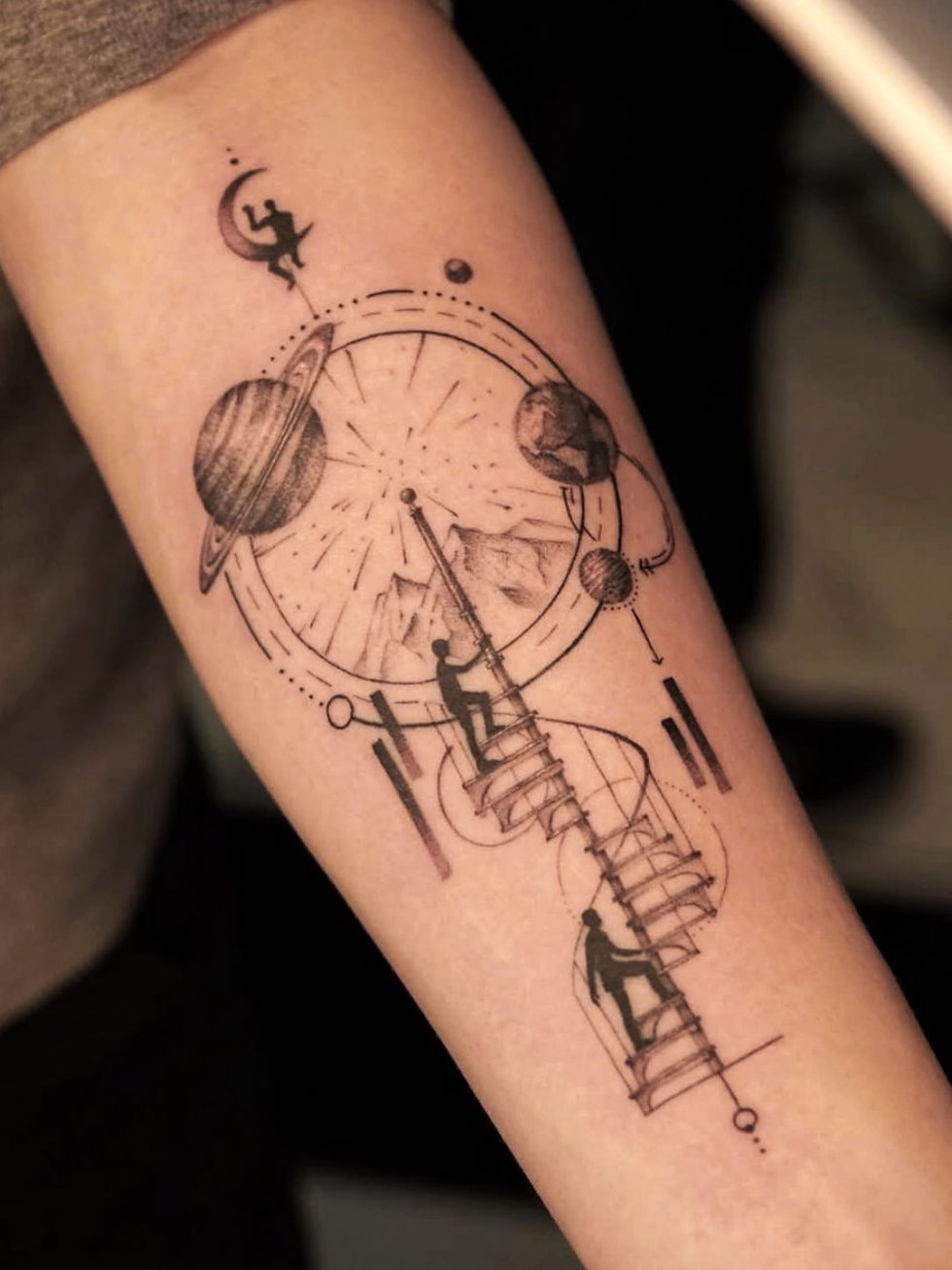
When we evaluate whether a geometric tattoo is likely to hold up well, we do not start with trend appeal or symbolism. We start with readability five years from now.
The first questions are practical:
- How large does this design need to be for the line spacing to survive well?
- Does the placement stay relatively stable, or does it stretch and twist constantly?
- Is the symmetry essential, and if so, can this body area support it?
- Will the contrast still make sense after healing?
- Is the client asking for a fine-line look that conflicts with the design’s long-term needs?
For example, a geometric forearm piece often gives more usable surface and more predictable readability than the same design compressed onto a small wrist area. A calf or outer upper arm may support larger repeated forms better than a highly mobile joint. A chest or rib design may look striking, but if the pattern depends on exact visual balance, body movement and anatomy have to be considered from the start.
At HON, this is where clear guidance matters most. We would rather adjust scale, simplify a pattern, or change placement before tattooing than let someone commit to a version that only looks good in the mockup. That is part of tattooing responsibly: protecting the long-term result, not just the first impression.
How do size and placement affect the long-term result?
Size and placement affect longevity as much as style does. A strong geometric design can age poorly if it is forced into the wrong scale or body area.
Size:
Geometric tattoos need enough room for line separation and negative space. If the design includes repeating shapes, dotwork, or layered borders, each element needs breathing room. Going slightly larger often improves longevity far more than adding extra detail.
Placement:
Areas with flatter, more stable surfaces usually help geometric work read more cleanly. Areas that crease, compress, or twist a lot can make symmetry harder to maintain visually. That does not mean those placements are off-limits, but they require more adaptation.
Body flow:
A geometric tattoo should work with the body, not sit on it like a sticker. Sometimes the best long-term decision is to curve the design, open up spacing, or break strict symmetry so it looks better in motion and after healing.
What should you ask before deciding?

Ask questions that reveal how the artist thinks about longevity, not just how the fresh tattoo will look.
Useful questions include:
- How would you adjust this design so it stays readable over time?
- Is this too small for the amount of detail I want?
- Does this placement support clean symmetry?
- What line weight would you use here, and why?
- Where do you think this design could blur together later?
- Would you simplify anything before tattooing it?
Good answers should be specific. If an artist can explain what they would change and why, that is a strong sign they are designing for the skin rather than just reproducing an image.
How artist fit changes the outcome
Geometric tattoos reward precision. The artist fit matters because this style exposes inconsistency quickly: uneven spacing, shaky lines, weak saturation, and poor alignment are hard to hide.
That is why it helps to look for an artist whose portfolio shows:
- Clean, confident linework
- Consistent black saturation where needed
- Strong use of negative space
- Designs that follow the body well
- Healed work, if available, not only fresh tattoos
At HON, the right match is part of the process. If a client comes in asking for geometric work because they want something that stays visually strong over time, the goal is not to push them into the nearest available appointment. The goal is to review the idea, pressure-test the design choices, and match them with an artist whose strengths fit the piece.
Frequently Asked Questions Why Geometric Tattoos Hold Up So Well Over Time
Do geometric tattoos always age better than fine line tattoos?
No, geometric tattoos do not always age better automatically. They often age well because they are usually designed with clearer structure, stronger spacing, and more readable contrast, but poor execution or undersized detail can still make them age badly.
Are geometric tattoos a good choice for small tattoos?
Yes, geometric tattoos can work well at a small size if the design is simple enough. Small geometric tattoos age better when they use fewer elements, clearer spacing, and line weights that are not too delicate for the area.
What part of a geometric tattoo helps it stay readable?
The part that helps most is the overall structure. Clean line weight, open negative space, repeated shapes, and strong contrast usually keep a geometric tattoo readable even after the edges soften slightly with time.
Can a geometric tattoo blur if it is too detailed?
Yes, a geometric tattoo can blur visually if the pattern is too dense for the size. When lines and shapes are packed too closely together, the design can lose separation over time and stop reading as clearly as it did when fresh.
What should I bring to a consultation for a geometric tattoo?
Bring the core idea, reference images you genuinely like, and some flexibility about size and placement. A good consultation should turn that starting point into a version that fits your body, stays readable, and makes sense for long-term wear.
Related Artists
- Sui (@sui_tattoos) — Geometric
- Nika (@enormityink) — Blackwork
- Yongha (@yongha_blk) — Blackwork
- Sarah (@sarahstarz.tattoo) — Blackwork
- Min (@tattooermin) — Blackwork, Asian Illustrative
Related Styles
Related Articles
If you’re considering geometric work and want to know whether your idea will still read well years from now, the next useful step is a consultation that focuses on design clarity, scale, and placement — not just the reference image. At HON, that conversation should leave you with a clearer version of the tattoo, a realistic sense of how it will heal, and guidance you can still use after the appointment.
Visit Hon Tattoo Studio
Downtown Toronto
202 Queen St W, 2nd Floor, Toronto, ON M5V 1Z2
(437) 533 7749 - hontattoodowntown@gmail.com
North York
6293 Yonge St, North York, ON M2M 3X6
(905) 604 5102 - hontattoostudio@gmail.com
Vaughan
9671 Jane St Unit 4, Vaughan, ON L6A 3X5
(416) 728 8922 - hontattoovaughan@gmail.com
Website: hontattoo.com
Instagram: @hontattoostudio
Also, if you click the button below and send us your tattoo-related questions, we will do our best to provide you with accurate answers.
Related: See a real example on Instagram →


